Colors do more than just make your website look pretty—they talk to your visitors, guiding how they feel, what they notice, and even whether they stick around or click away. In the world of wellness, where so much of what we offer is rooted in how people feel, color becomes more than an aesthetic choice.
Let’s talk about color psychology—and how to use it to create the right mood, vibe, and client connection on your wellness website.
How color influences emotions on wellness websites
Here’s a quick breakdown of how some popular colors are often interpreted—and where they shine best in the wellness industry:
- Blue: Calm, trust, clarity. Often used in therapy, meditation, or life coaching sites.
- Green: Growth, balance, healing. Great for nutritionists, herbalists, and holistic health brands.
- Purple: Spirituality, transformation, wisdom. Popular for energy work, intuitive coaching, or breathwork.
- Neutrals (beige, taupe, gray): Clean, safe, supportive. A strong base for any minimalist wellness brand.
- Pink / peach: Nurturing, warm, inviting. Perfect for women-centered spaces, doulas, or emotional wellness.
- Earth tones: Grounded, stable, connected. Ideal for somatic work, nature-based healing, or eco-conscious brands.
The goal is to select a color palette that reflects your wellness brand personality and the emotional journey your client is on.
How to choose the right color palette for your wellness website
When choosing colors for your wellness business website, start with these questions:
- How do I want clients to feel when they land on my homepage?
- What type of transformation or experience am I offering?
- What emotions align with the services I provide?
- What visual language will resonate most with the clients I want to attract?
Your answers will help you move from “what looks good” to “what feels right”—which is where the magic happens.
Wellness website color palette ideas
Need inspiration? Here are some popular and effective color combinations for wellness websites:
Calm & Clear:
Pale blue, soft ivory, gentle gray
(Perfect for therapy or coaching websites focused on emotional clarity)

Natural & Nurturing:
Sage green, warm sand, soft blush
(Great for herbalists, nutritionists, or holistic brands)

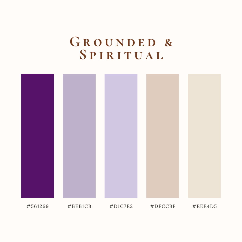
Grounded & Spiritual:
Lavender, deep plum, creamy beige
(Beautiful for energy workers and intuitive guides)
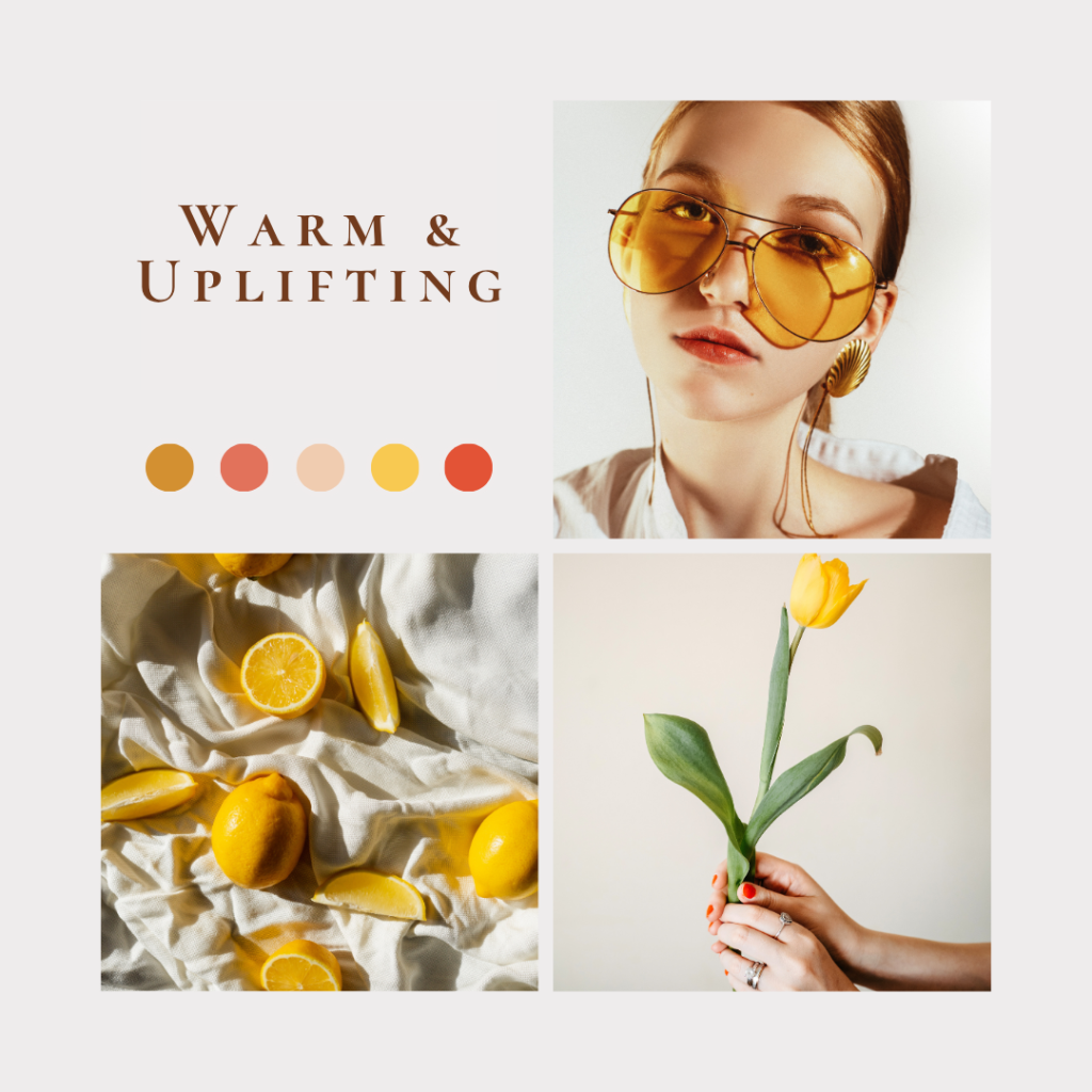
Warm & Uplifting:
Peach, terracotta, golden yellow
(For coaches focused on empowerment or lifestyle transformation)
When your website colors are aligned with your brand values and the emotional needs of your audience, you’re more likely to build trust and connection—which leads to higher engagement, more inquiries, and better client retention.
Not sure where to start? Let’s work together. Whether you’re ready for a full brand refresh or just need help fine-tuning your color palette, we’ll make sure your online presence reflects the transformation you offer and feels aligned every step of the way.